While perusing Hacker News I ran across a single-page site
called Contrast Rebellion— which I understand
has created a bit of controversy. I think the point espoused by Contrast Rebellion is both well-made
and well-taken (despite the host of straw-man style arguments to the
contrary); however, I feel that—in most designs—contrast arises
fairly organically. If I can’t read my font, or there isn’t enough
contrast in my color palate, then I know that the people from whom I
solicit opinions are going to mention that before saying anything
else. If only we were all so lucky. ☺ On the topic
of color contrast the W3C defines Success Criterion 1.4.3 saying: Contrast (Minimum): The visual presentation of text
and images of text has a contrast ratio of at least 4.5:1, except for
the following: (Level AA) There is a formula for calculating the contrast of two colors
available at the paciello group— they also have a
Contrast Analyser that you can download for Mac and Windows. Alternately, you could skip the download and the hand-cranking of
numbers and enter your hex codes into the Luminosity Colour
Contrast Ratio Analyser edit—11/23/2012 My new favorite tool for contrast checking is Lea Verou’s constrast
checker Looking at popular websites contrast The genesis of this exercise was to review websites I have built and
to review some other popular sites so lets do that … The contrast on this site It’s pretty good right? The text you’re reading I mean— it’easy to
read, contrast-wise anyway. edit—11/23/2012 You’re looking at Text color: #8f8d80 which means
that the contrast ratio here has dropped to 3.1:1—which meets the
success cirterion for the current text-size of 24px! (which is,
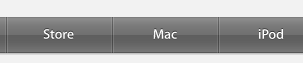
admittedly, very large, but whatever, I ain’t scared). Apple’s nav bar Apple’s nav bar is a gradient, so this analysis is for the color at
the lightest point of the gradient versus the text Google’s account settings bar The Google account settings bar has always seemed to be fairly
low-contrast to me—let’s test a theory. Out of curiousity I decided to see what these recommendations would
look like for Google in practice—answer: more readable, arguably less
aesthetically appealing (see below).


Posted