TL;DR: The margin isn’t a margin—it’s a space. Try
using ALSO: Checkout the amazing list of techniques to
combat inline-block space-margins at CSS
Tricks I’ve made a weird discovery about using the inline-block display. I
use inline-block elements on my homepage in the Recent Work
section. I noticed that the math for these block elements wasn’t quite adding
up—the element width + padding + margin + border should’ve enabled three
items on one line; however, the elements were wrapping. Here’s an example of what I’m talking about: Even though the margin of each element is set to zero there is
seemingly, a margin, between each element. This problem could be easily solved by removing the display property,
floating each gallery item and using a clearfix on the parent: That solution, however, ignores why that space is being
added. The inline-block display property treats block level elements
(e.g. Knowing what is creating an inline-block displayed
Here’s an example of what the second solution would look like: At Custom Channels we have our own API for Album Art. Our Album Art
API was designed before I got here, it was designed for the single
use-case of the Custom Channels standard flash player (i.e. 125×125 gif)
and isn’t what you’d call “future proof”. ANYWAY, we’re revisiting some of the Custom
Channels’ site design and one idea I had is to show a handful of
recently played albums from a few channels on our homepage. And a
125×125 gif ain’t gonna to cut the mustard! This brings us to the topic of this post—the Amazon Product
Advertising API—Step-by-Step. This assumes you’ve already got a development environment that runs
PHP5. The first thing to do, if you haven’t already, is to register for
Amazon Web Services After you’ve registered for a AWS account, login to your account
and go to the “My Account/Console” pulldown at the top and click,
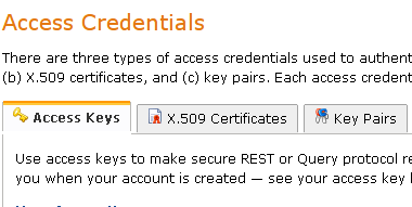
“Security Credentials” Scroll down to “Access
Credentials” Copy your “Access Key ID”, click “Show” and copy your “Secret
Access Key” Go ahead and clone the Amazon ECS PHP Library to your
development environment You’ll only be using the file
Once you’ve got that file it’s easy-peasy-lemon-squeezy:
The code above will take the argument from the “track” url
parameter and search Amazon’s digital music store and output the
large-format album art for the top match.t to input a
tag, q to quit. Meanwhile it's generating a csv file that
can be uploaded to LibraryThing.
The fruits of this labor were/are my (and Blazey's) Library Thing Catalog
display: block; float: left; instead.
<div>) as an inline element
(e.g. <span>), and, just like if you had a line break
between two <span> elements, the line-break between
the <div>s is creating a space between the
<div>s. That extra margin is actually a
space—not a margin.<div>’s “margin” enables you to create a couple of
different solutions.
display: block; float: left;

$ git clone https://github.com/Exeu/Amazon-ECS-PHP-Library.gitlib/AmazonECS.class.php so copy that wherever you’d
like
Posted
Posted
Posted
Posted