People think they lack motivation, what they really lack is
clarity – James Clear, Atomic Habits Code review innocently asks a staggering question: “does this code
look good to you?” It’s not even clear how to start to answer this
question – which makes putting off code reviews easy. With so many decisions left for the reviewer, the easiest decision is
to opt out – to defer code review for a time when I have more mental
energy. This post explores the problem of decision fatigue in code review.
Then it looks at individual and institutional strategies for fighting
fatigue. Code review is a big task for even a tiny change. But if your patch
is enormous and tricky, then you’re asking for a titanic share of my
willpower. When a review demands too much of my daily willpower reserve, I have
a few options: None of these options is fair to both the developer and the
reviewer. Often even the basic questions of code review are up to a reviewer to
decide. A thread on hacker news recently asked a fundamental question about
code review: do
you run the code as part of your review? The immediate responses
were illuminating to me, and I can summarize them as follows: Google’s code review guidelines are blasé on the subject: You can validate the CL [code under review] if you want – What to look for in a code review,
https://google.github.io/eng-practices/review/ Google’s engineering practices documentation goes on to mention times
you’ll definitely want to ensure you’ve run the code: UI changes and
parallelism — places where it’s easy (even likely) for an individual to
make a noticeable (in retrospect) mistake. But what about all the other
code reviews? We should optimize the code review process to reduce the decision
fatigue of reviewers. Here are a few tricks developers can use to lessen the mental
load: Some tools exist that ease the burden of remembering your review
backlog – Automattic has The
Stick, and Microsoft has Nudge. And studies
have shown code review reminder tools like these may speed up
reviews by as much as 60%. But there are no magic bullets. Code review’s harshest feedback is
silence. There are times when you gape as your code rots, awaiting final
judgement. And that sucks for everyone. To speed up the process, we’ve got to make it easier for
reviewers – we should start with a shared agreement about the
scope of review. Perhaps beginning with the fundamental question of
whether they’re even supposed to run the code. The answer here is
probably different for different teams and various types of software,
but we all do reviews; maybe we should all have review standards,
too. Thanks to Brennen Bearnes for
reading an early draft of this post and making it less
wronger. Last year, I spent $17 on an Aqara cube, and it’s been
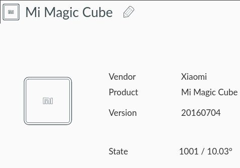
one of my best purchases for enjoyment per dollar spent. The Aqara cube is a three-inch square plastic cube that sends
gestures over Zigbee to a cheap
off-the-shelf dongle. By pairing this cube with Home Assistant, I have a
three-dimensional button with 45 unique interactions to control whatever
I want. And over the last six months, I’ve used it to control a small fleet
of antiquated streaming devices to help me discover new music. The Logitech Squeezebox is a bygone streaming device that was too
beautiful for this world. Logitech snuffed the Squeezebox in 2012. But because others share my enthusiasm for Squeezeboxes, there’s
still hope. The second-hand market persists. And there are wonderful
nerds cobbling together
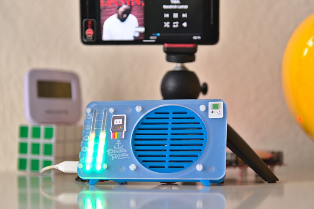
Squeezeboxes from Raspberry Pis. I built a DIY Squeezebox from a Pi Zero Pimoroni
PirateRadio kit and Squeezelite
software. I blanket my humble abode in music by combining a DIY PirateRadio, a
Squeezebox Boom, and a Squeezebox Touch. My Dockerized Logitech Media Server perfectly synchronizes these
three devices. Music from Spotify or WQXR is seamless when you walk from
bedroom to kitchen to dining room. Home Assistant is open-source home automation software, and it’s the
only IoT software I don’t find myself screaming at regularly. And, of course, there’s a Logitech
Squeezebox integration for Home Assistant. The integration lets you
use Logitech Media Server’s (somewhat esoteric)
API to control your devices from Home Assistant. I also use a community-made Home
Assistant Blueprint that automates each of the cube’s 45 unique
gestures. Currently, since my mental stack is tiny, I only use four
gestures: In a 2011 article, “A
Brief Rant on the Future of Interaction Design,” Brett Victor
describes touchscreens as “pictures under glass.”
I loathe pictures under glass. It’s impossible to use a device with a touchscreen without looking at
it. And touchscreen interaction is slow – traversing a menu system is
all point-and-click, there are no shortcuts. Another alternative is control via smart speakers –
devices literally straight out of a dystopian novel. While the smart speaker is the closest thing to a ubiquitous
command-line interface in everyday use, I’m too weirded-out to
have a smart speaker in my house. I’ve opted for a better way: shake a cube and music appears. The cube is a pleasant tactile experience – shake
it, tap it, spin it – its a weighty and fun fidget toy. Its
design affords instant access to all its features – there is no
menu system to dig through. The cube is frictionless calm
technology and it’s behaved beautifully in the background of my
day-to-day for months.
Code review is a request for my willpower

Where to even begin code review
Requesting changes to the code review process
🎭 The Tragedy of the Logitech Squeezebox


Home Assistant is ✨magic✨


🧐 Why would anyone do this?
Posted
Posted