For many people the first word that comes to mind when they think
about statistical charts is “lie.” – Edward R. Tufte When I moved from engineering to management, people expected me to
make charts. After spending some time learning about data visualization, I’ve come
to two important conclusions: But creating a compelling chart is an underrated superpower for
engineers. Here are some ideas that helped me learn how to do that. The best books I’ve read on data visualization are: Between those two books, you get a balance: the ideal (from Tufte)
and the PowerPoint world (from Knaflic). Tufte Edward R.
Tufte is professor emeritus of statistics, political science, and
computer science at Yale. And he’s a man upset by pie charts. the only worse design than a pie chart is several of them. – Edward R. Tufte Tufte’s rules: Knaflic Cole Nussbaumer Knaflic was the former manager of Google’s People
Analytics team. She knows her way around a PowerPoint1. Knaflic’s rules: Take a look at this chart from the Wikimedia Foundation’s 2023–2024
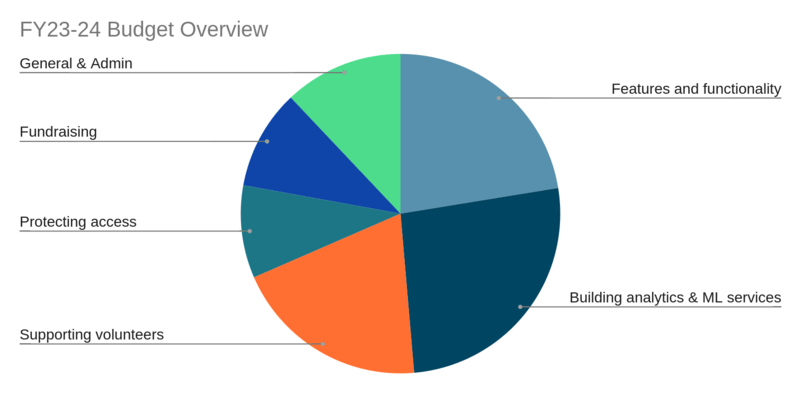
budget projections: This is a default Google Sheets chart for this data. What I’m able to glean from this chart: Now consider what we glean from the table used to generate it: This table gives us more information than the chart in a similar
amount of space. From the table, we learn: And we get rid of the meaningless colors. OK—confession time: there were percentages on the original pie chart.
I edited them out. But I did that to prove a point. The pie chart is doing less
work than the numbers. The slices of the pie add almost nothing
to the numbers. Tufte would prefer the table above to the pie chart above because the
table: And in this case, I agree: I like the table. But choosing data visualizations is difficult. If you intend to communicate, then people must be able to read your
chart. In 1985, Cleveland & McGill conducted what is still the most
cited experiment on what
charts are easiest to read. Their purpose was simple: rank standard
charts by the number of errors people make while reading them. Here’s their ranking of charts—from easiest to hardest to read: But I love heatmaps! You can use heatmaps. Just understand that only
a sophisticated audience can interpret heatmaps correctly. Know your audience, then use something like the data viz catalog to choose
your chart. Charts are communication. At their worst, as Tufte said, they’re little more than “devices for
showing the obvious to the ignorant.” But at their best, they’re a powerful way to intuitively communicate
a lot of data in a small space. Tufte will not help you with
PowerPoint. In his essay, “The
Cognitive Style of PowerPoint” (which is included in the book “Beautiful
Evidence”), he says: “bulleted outlines make us stupid” before going
on to blame PowerPoint for the
space shuttle Columbia disaster.↩︎ To see posts by date, check out the archives
![William Playfair, 1801, Statistical map showing the extent, population and income of the principal nations of Europe The birth of the pie chart. Playfair’s attempt to show the size of European countries by relating them to planets, saying: “we have a more accurate idea of the sizes of the planets, which are spheres, than of the nations of Europe […] all of which are irregular forms”](https://photos.tylercipriani.com/thumbs/4d/7b7093596f72b025439eda463f52ca/large.jpg)
Learning from experts
Tufte’s principles: a case study
Program
Budget (millions)
Percent
Building analytics & ML services
$46.4
26.2%
Features and functionality
$39.7
22.4%
Supporting volunteers
$35.1
19.8%
General & Admin
$21.3
12.0%
Fundraising
$17.9
10.1%
Protecting access
$16.6
9.4%
Total
$177.0
100.0%
How to choose a chart: visual perception accuracy ranked
Icon
Name
Example
![]()
Position along a common scale
scatterplots,
bar
charts,
sparklines
![]()
Positions along nonaligned scales
stacked
bar charts
![]()
Length, direction, angle
pie
charts,
donut
charts
![]()
Area
bubble
charts,
treemaps
![]()
Volume, curvature
3d charts
![]()
Shading, color saturation
Heatmaps
Tell a story
To see posts by date, check out the archives
If there’s one thing that feels like it’s gotten worse in my lifetime, it’s air quality.
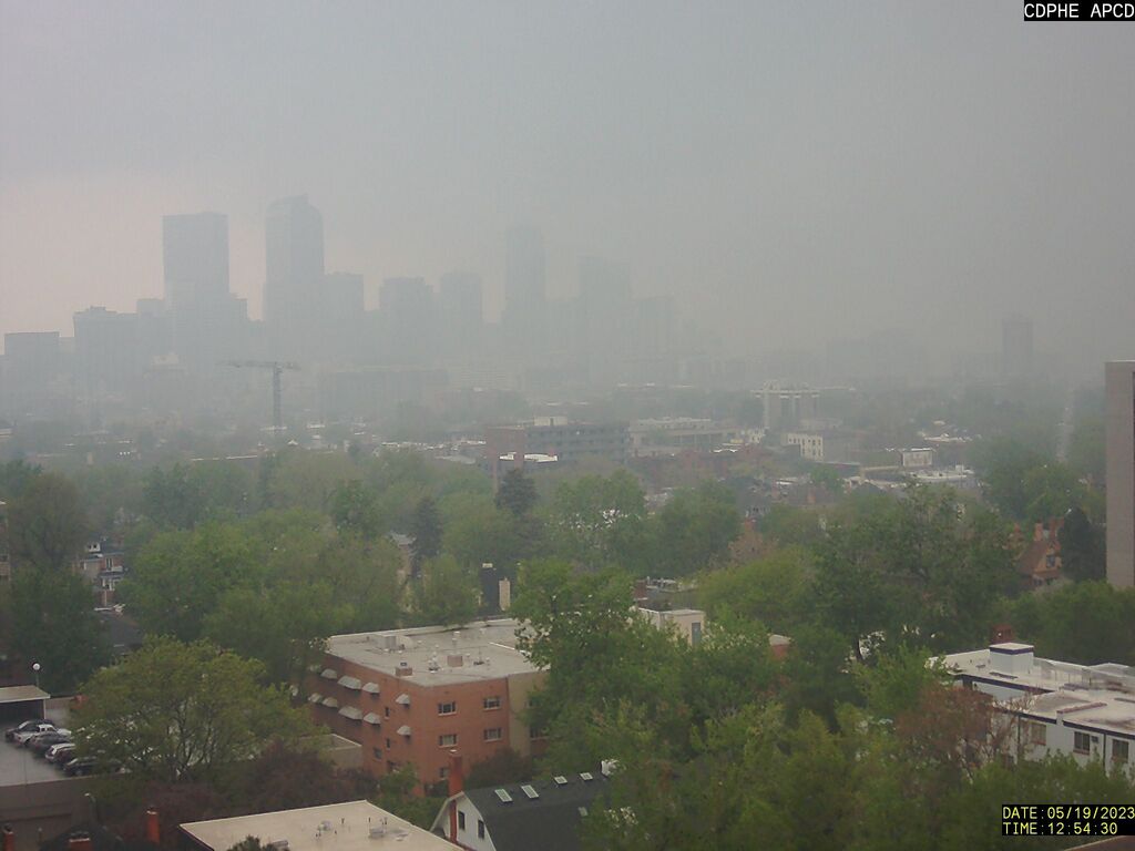
Colorado’s air quality last week was dismal, filled with smoke from Canadian wildfires, making Denver’s air quality among the worst of any major city.
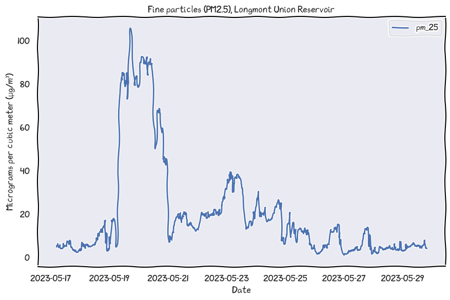
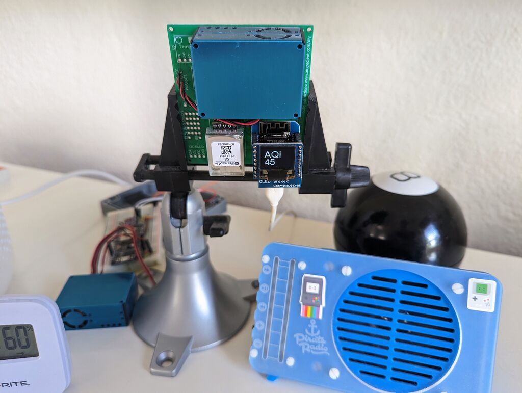
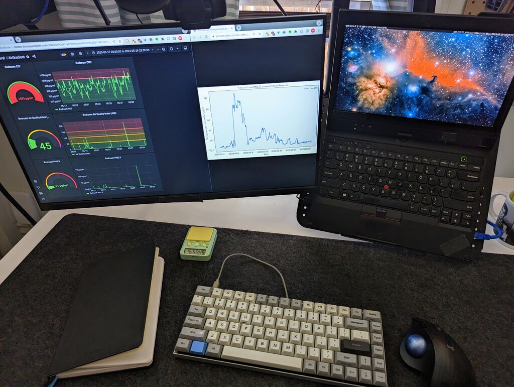
This is what happened to air quality four miles from my house:
And here’s the air quality index (AQI) in my bedroom:
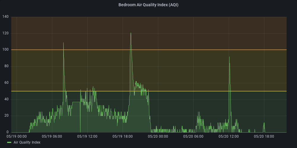
You can see spikes from cooking. And you can see the moment (2023-05-19T22:25 MDT) I swapped out the aging filter on my little LEVOIT air purifier, holding particulate in check, returning indoor air quality to baseline.
Why care about air quality?
Acute exposure to air pollution makes you acutely dumber.
This was the conclusion of MIT researchers back in 2022 when they looked at the effect of air quality on chess.
They combed through 30,000 chess moves, evaluating them with the Stockfish chess engine, comparing 121 players against themselves under different air quality conditions (which they monitored with foobot sensors).
The researchers concluded that an increase as small as 10 µg/m³ PM2.5 causes a 2.1% increased likelihood of player error.
Measuring air quality
Reference particle mass counters cost thousands of dollars. And even so-called low-cost air sensors like the ubiquitous PurpleAir will set you back $200.
But the same sensors used inside the PurpleAir, the PlanTower PMS5003, can be found for as little as $15 on AliExpress.
The Plantower sensor, however, is far from a reference device. But studies suggest it’s directionally correct. And, with after-the-factory calibration, it can match readings from more expensive reference meters1.
The Plantower PMS5003 features in AirGradient’s DIY printed circuit board (PCB), which combines air quality, temperature, and CO2 sensors with a cheap ESP8266 for internet. I ordered ten of these PCBs from PCBWay back in 2021 for about $30.
I’ve since modified AirGradient’s example code to support pushing data to Home Assistant via MQTT. From there, sensor data gets sucked up by Prometheus, so I can monitor it via Grafana.
This system gives me a full view of my indoor air quality. And it’s a needlessly complicated way of reminding me to change out my air filter 😬.
To see posts by date, check out the archives