Last year, I spent $17 on an Aqara cube, and it’s been one of my best purchases for enjoyment per dollar spent.
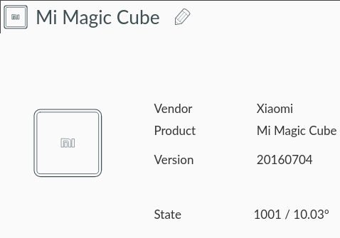
The Aqara cube is a three-inch square plastic cube that sends gestures over Zigbee to a cheap off-the-shelf dongle.
By pairing this cube with Home Assistant, I have a three-dimensional button with 45 unique interactions to control whatever I want.
And over the last six months, I’ve used it to control a small fleet of antiquated streaming devices to help me discover new music.
🎭 The Tragedy of the Logitech Squeezebox
The Logitech Squeezebox is a bygone streaming device that was too beautiful for this world. Logitech snuffed the Squeezebox in 2012.
But because others share my enthusiasm for Squeezeboxes, there’s still hope. The second-hand market persists. And there are wonderful nerds cobbling together Squeezeboxes from Raspberry Pis.

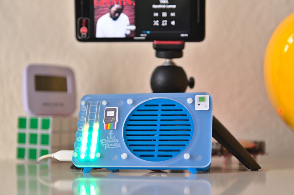
I built a DIY Squeezebox from a Pi Zero Pimoroni PirateRadio kit and Squeezelite software.
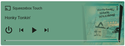
I blanket my humble abode in music by combining a DIY PirateRadio, a Squeezebox Boom, and a Squeezebox Touch.
My Dockerized Logitech Media Server perfectly synchronizes these three devices. Music from Spotify or WQXR is seamless when you walk from bedroom to kitchen to dining room.

Home Assistant is ✨magic✨
Home Assistant is open-source home automation software, and it’s the only IoT software I don’t find myself screaming at regularly.
And, of course, there’s a Logitech Squeezebox integration for Home Assistant. The integration lets you use Logitech Media Server’s (somewhat esoteric) API to control your devices from Home Assistant.

I also use a community-made Home Assistant Blueprint that automates each of the cube’s 45 unique gestures.

Currently, since my mental stack is tiny, I only use four gestures:
- Shake: Turn on all players, and start playing a random album from Spotify (that’s right, album – I’m old enough to yearn for the halcyon days of Rdio).
- Double-tap: Turn off all players.
- Flip: Next track.
- Twist: Twist right for volume up; twist left for volume down – like a volume knob.
🧐 Why would anyone do this?
In a 2011 article, “A Brief Rant on the Future of Interaction Design,” Brett Victor describes touchscreens as “pictures under glass.” I loathe pictures under glass.
It’s impossible to use a device with a touchscreen without looking at it. And touchscreen interaction is slow – traversing a menu system is all point-and-click, there are no shortcuts.
Another alternative is control via smart speakers – devices literally straight out of a dystopian novel.
While the smart speaker is the closest thing to a ubiquitous command-line interface in everyday use, I’m too weirded-out to have a smart speaker in my house.
I’ve opted for a better way: shake a cube and music appears.
The cube is a pleasant tactile experience – shake it, tap it, spin it – its a weighty and fun fidget toy. Its design affords instant access to all its features – there is no menu system to dig through.
The cube is frictionless calm technology and it’s behaved beautifully in the background of my day-to-day for months.